Small Paisley Rangoli
A small paisley design. Started with a swasthik but ended to a different design. I will upload the stages of this rangoli later as my editing software is down. At times we start to work on a design, b.
A small paisley design. Started with a swasthik but ended to a different design. I will upload the stages of this rangoli later as my editing software is down. At times we start to work on a design, but ends up into unexpected display. This is one such rangoli.
After drawing a swasthik, tried to add some lines, but that turned out to be a paisley without my knowledge. I was taken along with flower of the design. After paisleys bloomed next drew a boundary, so that there was no room to escape. If a paisley found its place in the rangoli, then the entire family adorns the rangoli. In the next layer the small paisleys took their place and again enclosed with a minaret shape.
This is the history of the basic design. I loved the original version outlined in white rangoli powder, but felt I should use the colour powders to clear the stock, as I have a fresh colours waiting for me in Chennai. My friend has taken the pain to purchase colour powders and nylon rangoli powder - its a white rangoli powder, all the way from Bangalore. In my next visit need to stuff into my personal baggage. I am not sure how much could I pack, Still need to look out for a special offer in the baggage with the airlines while travelling... Hope it may sound funny to many, but to me it sounds perfect. The different colours and its shades really make me re-energise to move forward and continue my passion of drawing kolams. If I had drawn the same designs on canvas, then many would have applauded, but kolams are pro tem, that may be the reason many look down as a waste of time. Thanks to the technology as we are in an era of digitalising our work. 15 years ago photographing a kolam seemed insane. Now there is no such fuss about taking photographs.
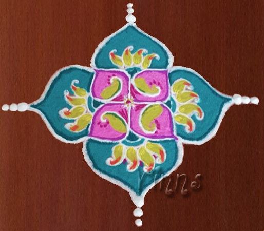
While selecting colours, I was tempted to use purple shades, but as I have desisted not to use purple shades in near future moved on to pink... But gave a purple outline to the inner minarets as I felt pink and purple have good affinity between each other. I used greenyellow shade of green for the paisleys to give a tender leaves effect, highlighted with dark green shade. And used blue shade to the outer minarets. It looked like a marine Blue, but it had a different effect through the lens. But still it looked good to my eyes.
Related Traditional Patterns
Similar geometries, symmetry types, and festive floor art styles